
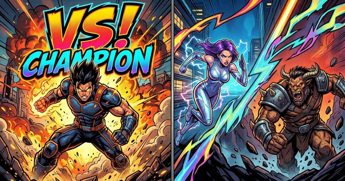
A comic-style YouTube thumbnail uses bold outlines, high contrast, and dramatic text to create a strong visual impression. This guide walks through two ways to build one, depending on whether your video features one subject or two, and gives you exact steps for each.
This is different from a general tutorial. Instead of walking through one fixed process, it helps you pick the right approach first, based on what your video is actually about.
What Makes a Thumbnail Feel “Comic-Style”?
A comic-style thumbnail borrows visual habits from comic book covers: bold black outlines, punchy colors, and text that has a bold, expressive appearance rather than a plain typed look. These elements can help a small image stand out in a crowded video feed.
High contrast is especially useful here. A comic-style design usually pairs a bright, saturated color against a dark background, or vice versa, so the thumbnail can remain readable at a small size. Dramatic text placement, like a tilted title or a bold outline, adds to the effect without needing any drawing skill.
Two Ways to Build One, Depending on Your Video
The right layout depends on how many subjects your video is about. A single-character video and a matchup video can benefit from different compositions.
Option 1 — One Character or Scene (Title Card Style)
If your video focuses on one character, one moment, or one topic, a centered title card style can work well. This layout puts one focal image in the center or background, with bold title text layered on top.
Option 2 — Two Characters Facing Off (Split-Screen Style)
If your video compares two characters, teams, or ideas, a split-screen layout can communicate that clearly. Each side gets its own image, divided by a line or angle, with a large “VS” or comparison text in the middle.
Step-by-Step: Building a Single-Subject Thumbnail
Here is how to build the title card style described above.
Step 1 — Pick Your Focal Image
Choose one clear image or leave the background as a bold solid color or gradient if you don’t have a photo. Either option can work, since the text and effects will carry much of the visual weight.
Step 2 — Add Bold Title Text
Type a short, punchy title, ideally just a few words. Keep the font bold and the letters large enough to read at a small size.
Step 3 — Add Comic Effects
Layer in an outline around your text, and optionally a texture or dramatic accent like a splatter effect, to reinforce the comic feel. Keep these effects focused rather than covering the whole image, so your title stays the clear focal point.
Step 4 — Export at the Right Size
Export your thumbnail at 3840 by 2160 pixels with a 16:9 aspect ratio. Check the image at a smaller size before uploading, since thumbnails can appear quite small on different devices and surfaces.
Step-by-Step: Building a Versus-Style Thumbnail
A split-screen thumbnail follows a similar process, with one key difference: you’re working with two images instead of one.
Start by placing your two subjects on opposite sides of the frame, divided by a straight or angled line down the middle. Add a bold “VS” or comparison word at the center point, where both sides meet. Keep each side’s background simple, often a contrasting color like red versus blue, so the two subjects read as clearly opposed. Finish by adding each subject’s name near their side, then export at 3840 by 2160 pixels with a 16:9 aspect ratio.
Common Thumbnail Sizes for YouTube
| Format | Size | Ratio |
|---|---|---|
| Standard thumbnail | 3840 x 2160 px | 16:9 |
| Shorts cover | 1080 x 1920 px | 9:16 |
| Channel banner | 2560 x 1440 px | 16:9 (with safe zones) |
FAQs
What software do I need to make a comic-style thumbnail?
None. Free browser-based tools can handle text, outlines, and effects without needing Photoshop or any other design software.
Should every thumbnail on my channel use the same style?
Not necessarily, but keeping a consistent color palette or font across videos can help your channel feel more recognizable over time.
Is a split-screen thumbnail always better for comparison videos?
It’s often a clear choice because it visually signals a comparison before the viewer reads the full title.
What’s the biggest mistake people make with comic-style thumbnails?
Overcrowding the design with too many colors or effects at once is a common mistake, which can make the thumbnail harder to read rather than more eye-catching.
Do I need a photo to make a comic-style thumbnail?
No. A bold solid color or gradient background works well too, especially for the single-subject title card style.
Next Step
Decide whether your video needs a single-subject or versus-style layout, then follow the matching steps above to build your thumbnail.