
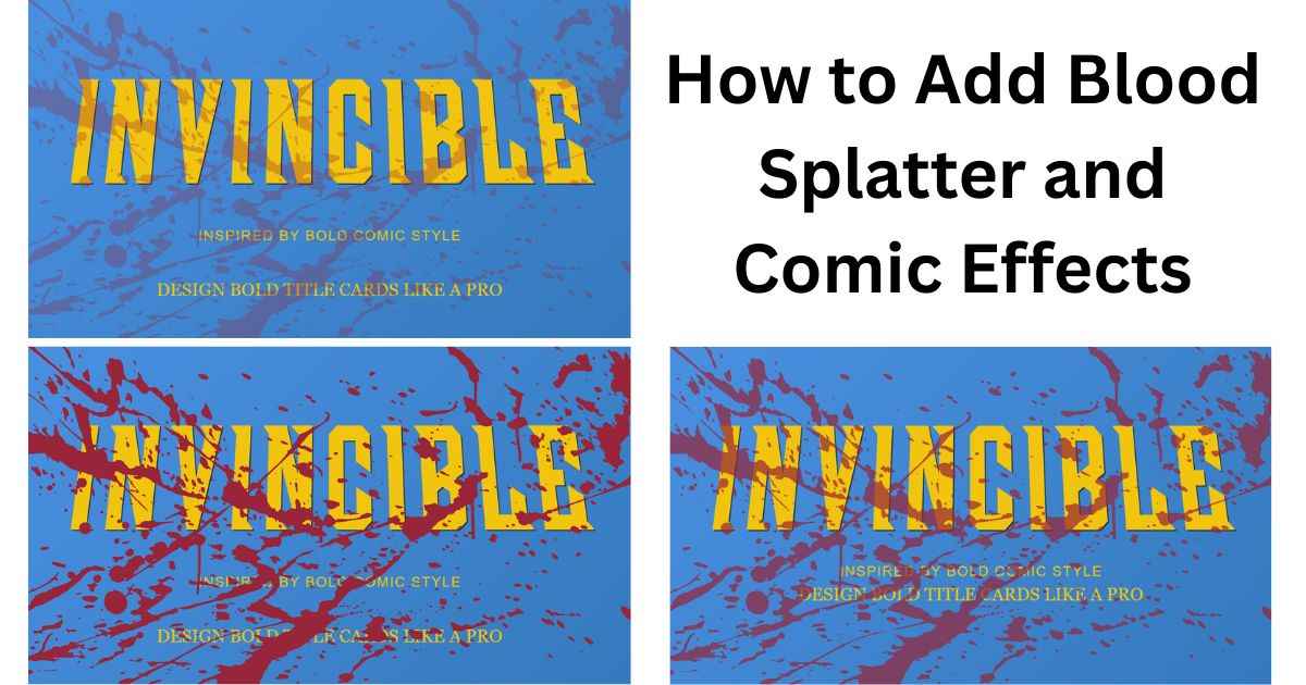
A blood splatter effect can turn a plain thumbnail into something dramatic, but only if it’s placed and sized correctly. This guide takes a close look at exactly that: where to put the effect, how much opacity to use, and which outline styles pair well with it.
This is different from a general tutorial on making thumbnails. It zooms in on one feature and covers it in real depth, since getting this one effect right makes a bigger difference than most people expect.
Why This Effect Works So Well for Action Thumbnails
A blood splatter effect signals genre and tone instantly, before a viewer reads a single word. It can visually suggest intensity in a way that plain text alone may not.
Red splatter and irregular shapes create strong visual contrast, which can make the effect noticeable alongside the main text. For action, horror, or high-stakes content, this effect gives an immediate emotional cue that matches what the video is actually about.
Where to Place the Effect (And Where Not To)
Placement changes how dramatic or how messy an effect looks more than any other setting. The same splatter graphic can look sharp in one spot and chaotic in another.
Edges and Corners (Safest Choice)
Placing the effect along the edges or corners of the frame keeps the center clear for your text. This is a useful starting point, since it adds drama while leaving the center relatively clear for your title.
Full Coverage (Use Sparingly)
Covering the entire thumbnail with the effect creates a stronger, more chaotic feel, but it also risks making text harder to read. Full coverage can work when the title is short and the outline provides enough separation from the busy background.
Behind the Text vs. In Front
Placing the effect behind the text is often a useful choice when readability is the priority. Layering it behind keeps your title fully readable while still letting the effect fill the space around it.
Getting the Opacity Right
A blood splatter effect at full opacity often looks harsh, while one set too low barely registers at all. The right level sits somewhere in between, strong enough to notice immediately but not so strong that it overwhelms the rest of the design.
A useful starting point is a medium-low opacity, then adjusting upward only if the effect still looks too faint against your specific background color. Adjust the opacity based on how strongly the splatter contrasts with your background. If it dominates the design, lower the opacity; if it disappears into the background, raise it slightly.
Pairing It With an Outline Style
The right outline style depends on how intense you want the final look to feel. Each style creates a different mood when combined with a splatter effect.
| Outline Style | Best Paired With | Mood |
|---|---|---|
| Solid | Full coverage, high opacity | Bold, direct |
| Double | Corner or edge placement | Sharp, high-contrast |
| Glow | Dark backgrounds | Dramatic, moody |
| Shadow | Subtle accent placement | Grounded, less intense |
A solid outline tends to work well when the effect covers more of the frame, since it keeps the text anchored against a busier background. A glow outline pairs especially well with darker scenes, since the light it creates helps the title stand out even more.
Three Looks You Can Build With This Effect
The same tool settings can create very different results depending on how they’re combined. Here are three distinct looks worth trying.
Subtle accent: Low opacity, placed only in one corner, with a solid outline on the text. This adds just enough drama without dominating the design, good for lighter action content.
Full dramatic: Higher opacity, full coverage, paired with a glow outline on a dark background. This creates a bold, high-stakes feel suited to intense moments or major reveals.
Horror-style: Medium-to-high opacity along the edges only, with a shadow outline and a near-black background. This keeps the center clear and readable while still delivering a tense, unsettling mood.
FAQs
Does a blood splatter effect work for every type of video?
No. It fits action, horror, or high-stakes content well, but it can feel out of place on lighter or more casual videos, where a cleaner design usually works better.
What opacity should I start with?
A medium-low opacity is a safe starting point. You can always increase it afterward if the effect looks too faint against your specific background.
Should the effect go behind or in front of the text?
Behind the text is usually the safer choice, since it keeps your title fully readable while the effect still fills the space around it.
Can I use this effect without an outline on my text?
Yes, but an outline usually makes the text easier to read once the effect is added, especially at higher opacity or with full coverage.
Is there a way to preview how strong the effect looks before finishing my design?
Yes. A live preview lets you adjust opacity and placement and see the result update immediately, so you can fine-tune it before exporting.
Next Step
Pick one of the three looks above that matches your content’s tone, then apply it using the placement and opacity guidance from this guide.