
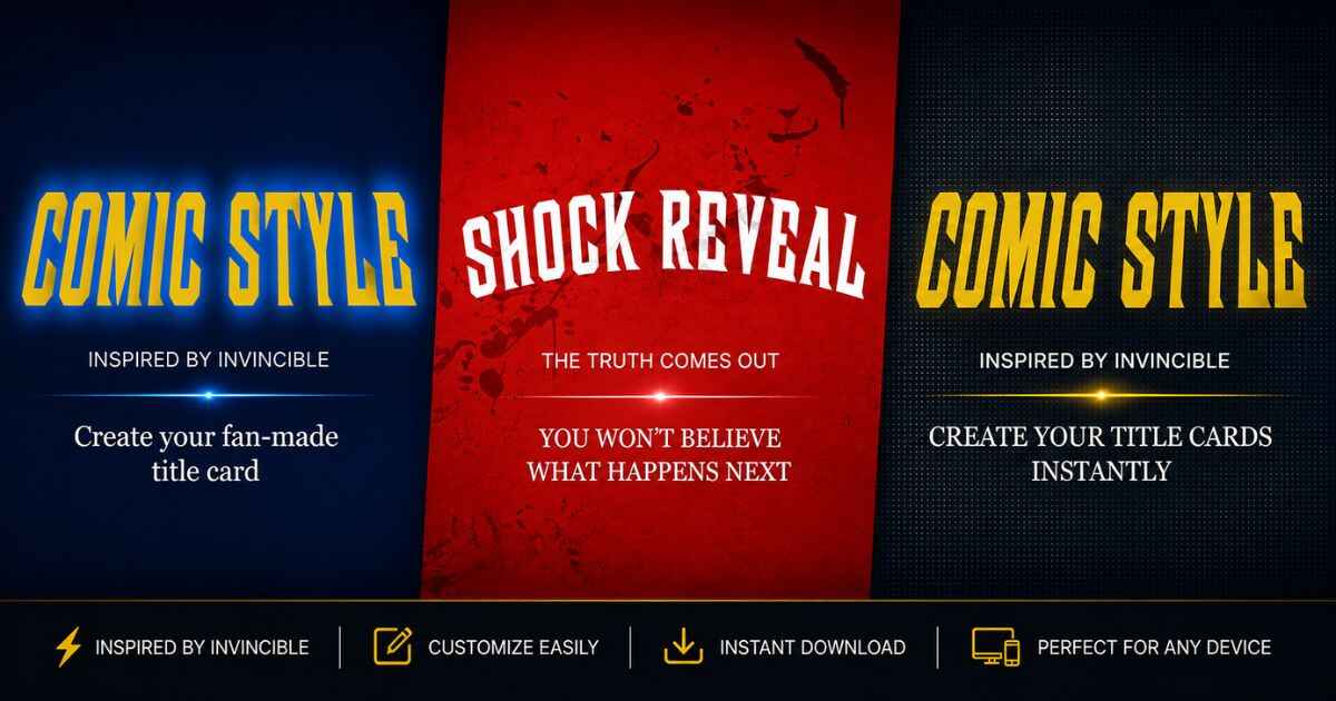
Looking for Invincible title card styles that actually stand out? Here are 10 different looks, from bold comic colors to moody dark designs, along with how to build each one using a free generator. Every style below gives you clear settings to try, not just vague ideas.
This list is different from a basic how-to guide. Instead of walking through every step, it focuses purely on the visual styles themselves, so you can jump straight to the look you want.
What Makes a Title Card Style Stand Out
A strong style usually comes down to three things working together: color, texture, and contrast. Get these right, and even a simple design looks sharp.
Color sets the mood right away. Texture adds depth, so the image doesn’t feel flat. Contrast keeps your text readable, even on a small screen. The 10 styles below each lean on a different mix of these three elements.
10 Invincible Title Card Styles to Try
1. Classic Bold Red
This style uses a bright red or gold background with bold, blocky text in a contrasting color. It feels loud and confident, which makes it a strong pick for action-focused thumbnails. To build this look, choose a red background, then set your title text to gold or white for strong contrast.

2. Comic Blood-Splatter
This style adds red splatter graphics across the card for a dramatic, high-stakes feel. It works especially well for intense or dark storylines. Turn on a blood effect, then adjust its placement, such as the edges or corners, so it frames your text instead of covering it.
3. Minimal Dark Mode
Sometimes less is more. This style uses a plain dark background with clean white or light gray text and no extra effects at all. It reads as modern and calm rather than loud. To recreate it, pick a dark color theme and leave the blood effects and textures turned off.
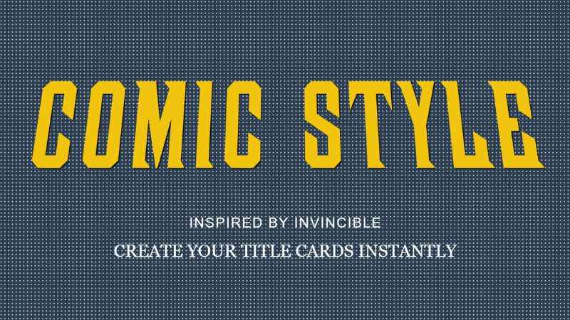
4. Halftone Comic Print
This style mimics old comic book printing, using small dot patterns layered over the background. It gives the card a textured, vintage feel without changing the colors underneath. Add a halftone texture if available, then keep its opacity low so it stays subtle.
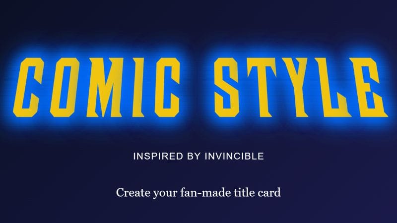
5. Neon Glow
Bright, glowing text against a dark background gives this style an electric, high-energy look. It stands out quickly in a crowded video feed. To build it, choose a dark background, then use a glow outline style for your main text if your generator includes one.
6. Worn Paper Edge
This style goes for a weathered, aged look rather than a clean digital one. A scratch texture over a paper-toned background creates a rough, worn feel, like an old printed page. Keep the texture light so it adds character without hiding your text.
7. Gradient Sky
A smooth color gradient background gives this style a polished, modern feel. Blues and purples work especially well for a calm, atmospheric look. Choose a blue or purple gradient, then keep your text simple so the gradient stays the focus.
8. Black and White Noir
This style strips out color entirely for a moody, cinematic feel. It works well for serious or suspenseful content. Use black, white, and gray for your background and text, then add a light grain texture for a film-like touch if available.
9. Textured Grunge
This style combines rough textures for a raw, gritty look. Layering scratches with film grain adds noise and imperfection, which feels less polished and more intense. Keep your background dark so the texture details show up clearly against your text.
10. Bright Pop Color
This style leans into bold, saturated colors for a fun, eye-catching design. It works well for lighter or more playful content. Pick a vivid background color, then choose a contrasting text color for clear, strong contrast.
Quick Reference: Style to Settings
| Style | Background | Texture or Effect | Outline |
|---|---|---|---|
| Classic Bold Red | Solid red | None | Solid |
| Comic Blood-Splatter | Any | Blood effect | Solid or shadow |
| Minimal Dark Mode | Dark solid | None | None |
| Halftone Comic Print | Any | Halftone texture | Solid |
| Neon Glow | Dark solid | None | Glow |
| Worn Paper Edge | Paper-toned | Scratches texture | Solid |
| Gradient Sky | Blue or purple gradient | None | None |
| Black and White Noir | Black or gray | Film grain | Shadow |
| Textured Grunge | Dark solid | Scratches + grain | Solid |
| Bright Pop Color | Bright solid | None | Solid |
How to Try Any of These Styles Yourself
You can build these looks with the Invincible title card maker using background colors, textures, and outline options that are available in the tool. These styles can also be built without using a photo or professional design software.
Start with a suitable color theme, then fine-tune the background, texture, and outline settings using the table above as a guide. Since the tool provides a live preview, you can preview each style as you adjust the settings before deciding which one fits your project.
FAQs
What is the most popular Invincible title card style?
There is no single confirmed most popular style, since preferences vary by creator and platform. Bold, high-contrast styles like Classic Bold Red and Neon Glow can be easier to notice when shown at a small size.
Can I combine two styles together?
Yes. If your generator lets you adjust the background, texture, and outline separately, you can mix elements from different styles, such as a gradient background with a glow outline.
Do I need a photo to use these styles?
No. Most of these styles rely on solid colors, gradients, and textures rather than a background photo, so you can build a complete design without uploading one.
Which style works best for horror or dark content?
Black and White Noir and Comic Blood-Splatter both suit darker, more intense content, since they lean on shadow, grain, and dramatic red accents.
Next Step
Pick the style that fits your project best, then open the free Invincible title card generator and start building it using the settings from the table above.