
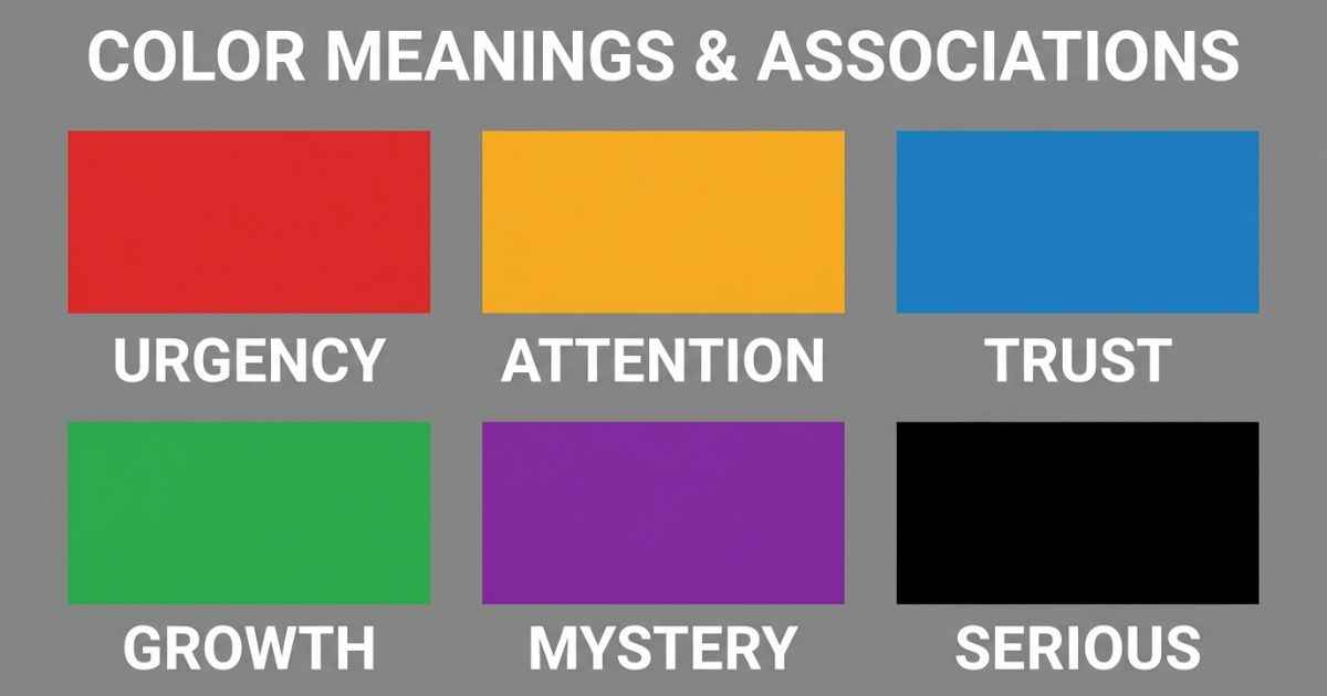
The psychology of color in thumbnails looks at how color can influence visual attention and perception before a viewer reads all the text. Red is often associated with urgency or danger, while yellow can attract attention and is sometimes associated with caution. Blue is often associated with calmness, stability, or trust. These effects can vary with context and design. Understanding how color and contrast can affect visual attention can help you create thumbnails that are easier to notice and understand.
Why Color Gets Processed Before Text Does
Color and written words are processed in different ways, and color can provide visual information very quickly. Reading and understanding text requires additional visual and language processing.
This matters in a YouTube feed. A viewer may scroll past many thumbnails in a short time. Color and contrast can influence what viewers notice as they first look at a thumbnail, sometimes before they have read all of the text. That first visual impression can be one factor in whether a thumbnail catches a viewer’s attention.
This is why color is not just decoration on a thumbnail. It can provide visual information before a viewer has finished reading the text.
What Each Color Tends to Signal
Red is often associated with urgency, danger, or importance, although the effect depends on the surrounding design and context. Red is commonly used in warnings, alerts, and other designs where urgency needs to be communicated. For intense or dramatic content, red can reinforce that visual tone. Using the same strong red treatment on every thumbnail can also reduce visual variety across your channel.
Orange and yellow can create a bright, energetic look and may attract visual attention when they contrast with their surroundings. Yellow and orange are common choices in some reaction and high-energy thumbnail styles because they create a bright, noticeable look.
Blue is often associated with calmness, stability, and trust, although the impression can change depending on the shade and context. For informative or educational content, blue can create a calm and stable visual tone.
Green is often associated with safety, nature, growth, and progress. It can fit well with tutorial content, progress videos, or topics related to improvement.
Purple is often associated with creativity, mystery, or a less familiar visual style. Purple can stand out when it contrasts with the colors used around it. This can make it a useful choice for theory videos or content with a mysterious visual tone.
Black, used as a background or a strong accent, can create a serious, dramatic, or sophisticated visual tone, especially when paired with a bright accent color.
Why High Contrast Matters More Than Any Single Color
Short answer: there is no single “best” color. Contrast can be more useful than searching for one universal color because it helps separate the subject and text from the background.
A lot of creators search for the one perfect thumbnail color. But color alone does not determine whether a thumbnail gets clicks. A bright red thumbnail may have a harder time standing out when many nearby thumbnails use a similar red treatment.
Visual differences in color, brightness, composition, or layout can help a thumbnail stand apart from nearby designs. Using clearly differentiated colors can also make separate elements easier to distinguish, especially when there is enough contrast between them.
This is the same reason the Power/Stat Card Maker gives each stat its own bold, different bar color instead of using one single shade. Different colors can make separate pieces of information easier to tell apart at a glance when there is enough contrast.
In practice, this means checking what colors your competitors and your own recent videos already use. Then pick something that stands apart from that group, instead of chasing one single “best” color that works for everyone.
Matching Color to Content Tone
Color choice works best when it matches what your video actually delivers. A mismatch between your color and your video’s tone can make the design feel less consistent with the content.
Action or danger-themed content can use red, or a strong mix of black and orange, to reinforce an intense visual tone. A fight scene breakdown or a dramatic story recap can use this kind of bold color choice.
Calm or informative content, like an explainer or analysis video, can use blue or green tones to support a calmer visual style.
Mystery or theory videos can use purple, deep blue, or muted tones to create a mysterious visual tone. The easiest way to test this is with color presets, like the character-inspired palettes built into the title card generator. Swapping a preset takes seconds, instead of rebuilding a color scheme by hand.
A Simple Color Test Before You Publish
Two quick tests can help you spot several common color and contrast problems before you publish. Neither one takes more than a minute.
The squint test means squinting at your thumbnail, or blurring it slightly if you’re on a computer. If your main subject and text remain easy to distinguish while blurred, your design has a useful level of visual separation. If everything blends together, you may need stronger contrast, clearer spacing, or a simpler visual hierarchy.
The grayscale test means turning your thumbnail black and white and checking if it still reads clearly. Brightness contrast is also important because it can help separate elements even when their colors are similar. If a thumbnail becomes difficult to understand in grayscale, check whether the subject, text, and background have enough brightness contrast.
FAQs
What color performs best for YouTube thumbnails?
There is no single color that performs best for every YouTube thumbnail. Color, contrast, topic, audience, title, and placement all affect how a thumbnail is perceived.
Does red always mean urgency on a thumbnail?
Red is often associated with urgency or importance, but its effect depends on context. A calm educational video using heavy red, for example, may create a different impression from a dramatic or action-focused video.
Why do so many thumbnails use yellow?
Yellow is bright and can attract attention when it has strong contrast with the surrounding design. It is also common in high-energy visual styles.
Is it bad to use the same color on every thumbnail?
Not necessarily. Using a consistent color can help with branding, but using exactly the same color treatment and layout on every thumbnail can make your uploads feel less visually varied.
How do I know if my thumbnail has enough contrast?
Try the squint test or the grayscale test. If your subject and text remain easy to distinguish when blurred or turned black and white, your design has useful visual separation.
Should color choice match my channel branding or my video’s content?
Ideally, both. Keeping one main brand color can help viewers recognize your channel. But shifting the accent color a little for each video, to match that video’s tone, can add variety while keeping your overall style recognizable.