
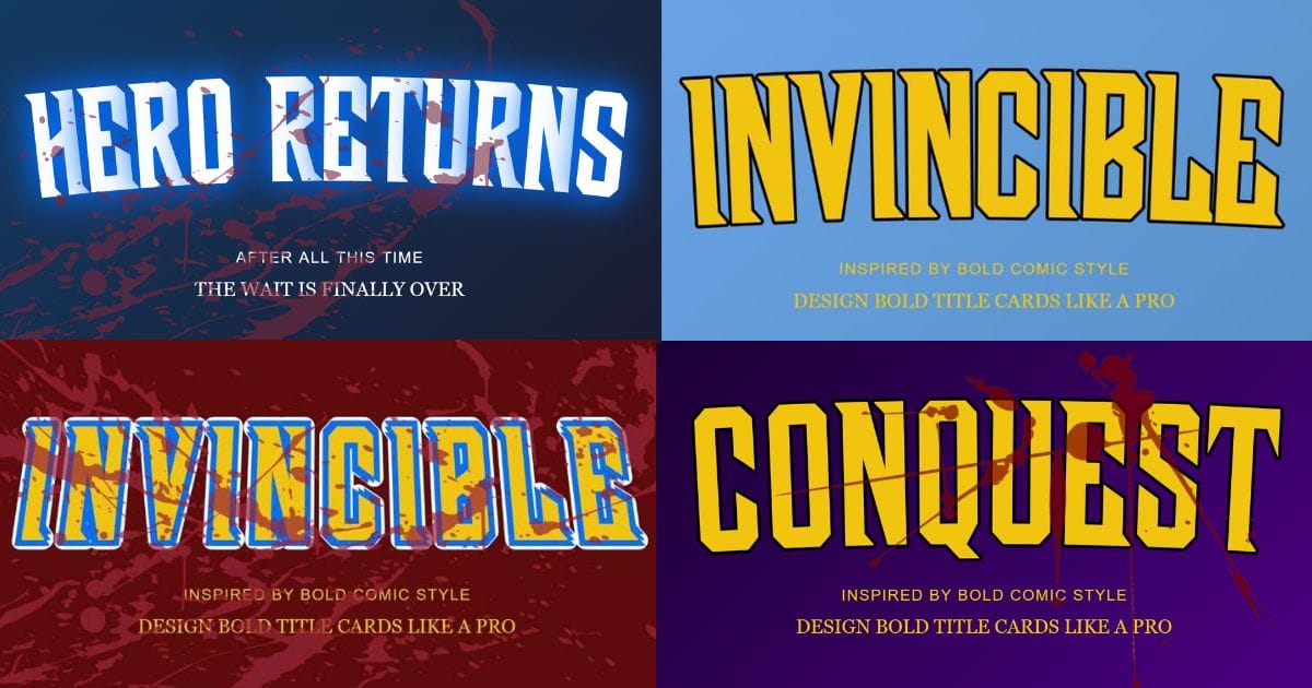
Looking for Invincible title card ideas that match a specific season’s mood? A title card built around a season’s tone can look more intentional than a generic design, and it can help viewers understand what kind of content to expect before they click. Below are ideas for each season, plus tips for matching the tone yourself.
This is different from a general styles list. Instead of ten random looks, this article focuses on matching your design choices to the feeling of a specific point in the story.
Why Season-Specific Title Cards Work Better
A title card that matches its season’s tone can give viewers a quick visual signal about what to expect. A calm, bright design can suggest something lighter, while a dark, intense design can suggest higher stakes.
This can be useful for recap videos, reaction content, or fan theories tied to a specific season. A viewer scrolling through a channel may be able to tell which season a video covers from the color and mood of the thumbnail, before reading the full title.
Season 1 Title Card Ideas
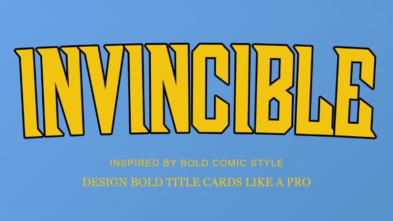
For Season 1 content, you can use a brighter, more hopeful tone to reflect the show’s introductions and origin-style storytelling. Blues, golds, and clean backgrounds can work well for this mood.
A few ideas to try:
- A bright blue gradient background with bold gold text, for a hopeful, introductory feel
- Minimal effects, so the design feels clean and approachable rather than intense
- A simple solid outline on your text, keeping the overall look sharp but not overwhelming
Season 1 also has plenty of intense and violent moments, so you do not have to avoid darker effects. For lighter Season 1 content, however, a cleaner design can fit the mood better.
Season 2 Title Card Ideas
Season 2 explores heavier themes, including Mark dealing with the events of Season 1 and his fear of becoming like his father. For this type of content, deeper colors and more dramatic effects can fit the mood.
A few ideas to try:
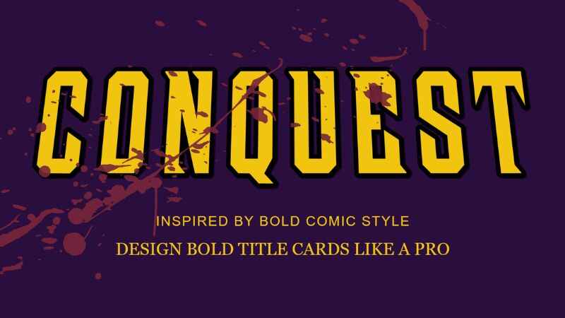
- A dark navy or purple background instead of bright blue, for a heavier feel
- A subtle blood-splatter effect at low opacity, placed at the edges rather than across the whole card
- A shadow-style outline on your main text, adding depth without feeling chaotic
This approach works well as a visual middle ground between a brighter Season 1 design and more intense designs for later story moments.
Season 3 Title Card Ideas
For Season 3 content covering major turning points or high-stakes moments, bolder and more dramatic title cards can fit well. Stronger effects and higher contrast are useful choices when you want the design to feel more intense.
A few ideas to try:
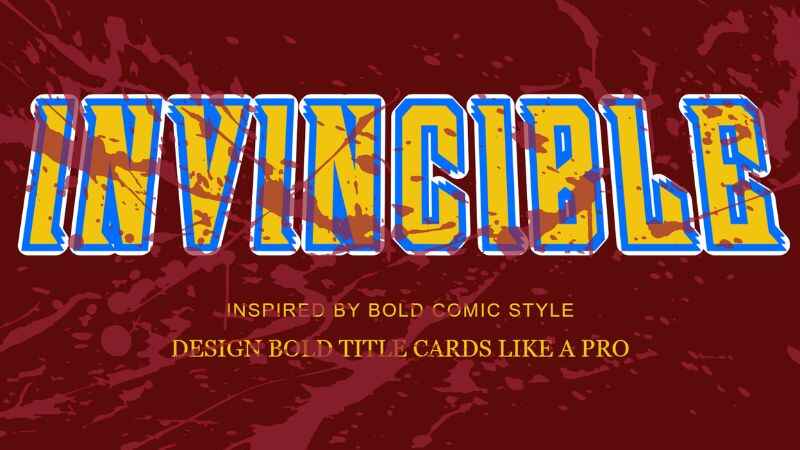
- A near-black or deep red background for maximum intensity
- A stronger blood-splatter effect, placed across more of the card for a dramatic feel
- A glow or double outline style on your main text, making it stand out against a darker scene
This is also a good stage to experiment with curved text, since a dramatic arc can add extra energy to a bold title.
Season 4 Title Card Ideas
For Season 4 content, you can use a darker or more mysterious design when creating recap, reaction, or discussion content around the current season. The goal can be to create anticipation while still matching the subject of your video.
A few ideas to try:
- A darker, more mysterious background that hints at the season’s story without revealing too much
- Bold, simple text with the character or story moment as the main focal point
- Controlled blood or texture effects that add drama without covering the main subject
You can also build a countdown teaser poster specifically designed for hype content, since it focuses on a number or date rather than a full scene.
How to Match Your Title Card to the Season’s Tone
Matching a title card to a season’s tone comes down to three choices: background color, effect intensity, and outline style. Lighter tones use brighter colors and fewer effects, while darker tones use deeper colors, stronger effects, and bolder outlines.
Start with the Invincible title card generator and adjust colors to match your season’s mood. If you are unsure where to start, begin with a neutral background, then gradually add effects until the intensity matches the tone you’re going for.
FAQs
Do I need different tools for different seasons?
No. One generator can build every style described here, since background color, effects, and outlines are all adjustable in the same tool.
What is the best color for a dark, intense title card?
Deep reds, near-black, and dark navy backgrounds tend to work well for intense or high-stakes content, especially when paired with a stronger outline style.
Should every title card in a series look the same?
Not necessarily. A creator can keep a consistent font and layout across a channel while shifting colors and effects to match each season’s tone.
Next Step
Pick the season tone that matches your content, then use the ideas above as a starting point to build your own design.