
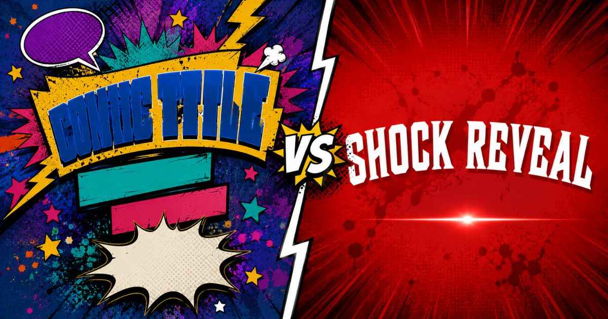
Small mistakes can make an Invincible title card harder to read or less visually effective, even when the idea behind it is solid. Below are the seven mistakes that can commonly happen, along with a simple fix for each one, so your next design looks cleaner and more professional.
This article takes a different approach than a general guide. Instead of explaining how to build a title card from scratch, it focuses only on what commonly goes wrong and how to catch it.
Why Small Mistakes Hurt Your Title Card’s Click Rate
A title card has very little time to catch attention, especially when it appears as a small thumbnail. Small issues like low contrast or cluttered text can make a design harder to read at that size, even if it looks fine up close.
Many of these mistakes can be fixed with a few simple changes. Some can be fixed with one or two simple changes, which makes them worth checking before you download your final image.
7 Common Mistakes (And How to Fix Each One)
1. Using Too Many Colors
Mixing too many bright colors at once can make a title card feel chaotic instead of bold. When every element competes for attention, nothing stands out.
The fix: Stick to two or three main colors, one for the background and one or two for your text. Need inspiration? You can explore these Invincible title card styles for color ideas, then borrow a combination that already works.
2. Text That’s Hard to Read
Light text on a light background, or dark text on a dark background, often looks fine on a full-size screen but can become difficult to see at thumbnail size. This is a common issue in fan-made designs.
The fix: Choose a text color that clearly contrasts with the background behind it. Adding a solid or shadow outline around your main text can also help it stand out, even against a busy or textured background.
3. Overcrowding the Design
Adding too much text, too many effects, or too many decorative elements at once can overwhelm a title card. A design with everything turned on rarely reads better than a simpler one.
The fix: Keep your main title short and let one element, like a bold outline or a single blood-splatter accent, carry most of the visual weight. Turn off any text line or effect you don’t need rather than leaving it in at low opacity.
4. Ignoring Mobile Preview Size
A design that looks great at full size can become harder to read once shrunk down to a phone screen, since viewers may first see a thumbnail at a small size. Fine details and thin text can also become harder to see.
The fix: Zoom out or view your design smaller before downloading it, and check whether the title text is still easy to read at that size. If it isn’t, increase the font size or simplify the background rather than adding more detail.
5. Low-Resolution Images
Uploading a small or blurry photo as a background can make the whole title card look soft or pixelated, even if the text and effects are sharp. This can be especially noticeable when the image is enlarged.
The fix: Use the highest-resolution photo available, and avoid stretching a small image to fill the frame. If you’re not using a photo at all, a solid color or gradient background avoids this issue completely.
6. Copying Official Show Art Too Closely
Trying to recreate the exact official title card, down to the font and layout, can look like a copy rather than a fresh design. It can also make the design look more closely connected to the official artwork than intended.
The fix: Use the show’s overall style as inspiration rather than a template to trace. A design that captures the same bold, comic-book feel in its own way can feel more original and make the unofficial nature clearer.
7. Skipping the Preview Before Download
Downloading a title card without a final check is an easy way to miss small issues, like text that runs slightly off-center or an effect that’s stronger than intended.
The fix: Always look over the full preview before downloading, checking text placement, contrast, and overall balance one more time.
How to Fix These Issues Quickly
Most of these mistakes share the same root cause: a setting that wasn’t double-checked before exporting. The Invincible title card generator shows a live preview as you edit, so you can catch these issues before downloading rather than after.
A quick checklist can help before you export:
- Do your colors stay under three main tones?
- Is your text clearly readable against the background?
- Does the design still read well at a smaller size?
- Is your background image sharp, not blurry or stretched?
If you can answer yes to all four, your title card is in good shape.
FAQs
What is the most common Invincible title card mistake?
Low contrast between text and background is a common issue, since it’s easy to miss on a full-size screen but can become more obvious once the image shrinks to thumbnail size.
How do I know if my title card is too cluttered?
If you struggle to identify one clear focal point quickly, the design likely has too many competing elements.
Should I always add effects like blood-splatter or textures?
No. Effects work best when used with a clear purpose, such as adding drama to a specific scene. A clean design with no effects at all is often stronger than one with too many.
Is it okay to use a low-resolution photo if I resize it smaller?
Shrinking a low-resolution photo can help slightly, but it won’t fully fix blurriness. Starting with a sharper image gives a better result overall.
Next Step
Run through the checklist above on your current design, then fix any issues before you download your final title card.