
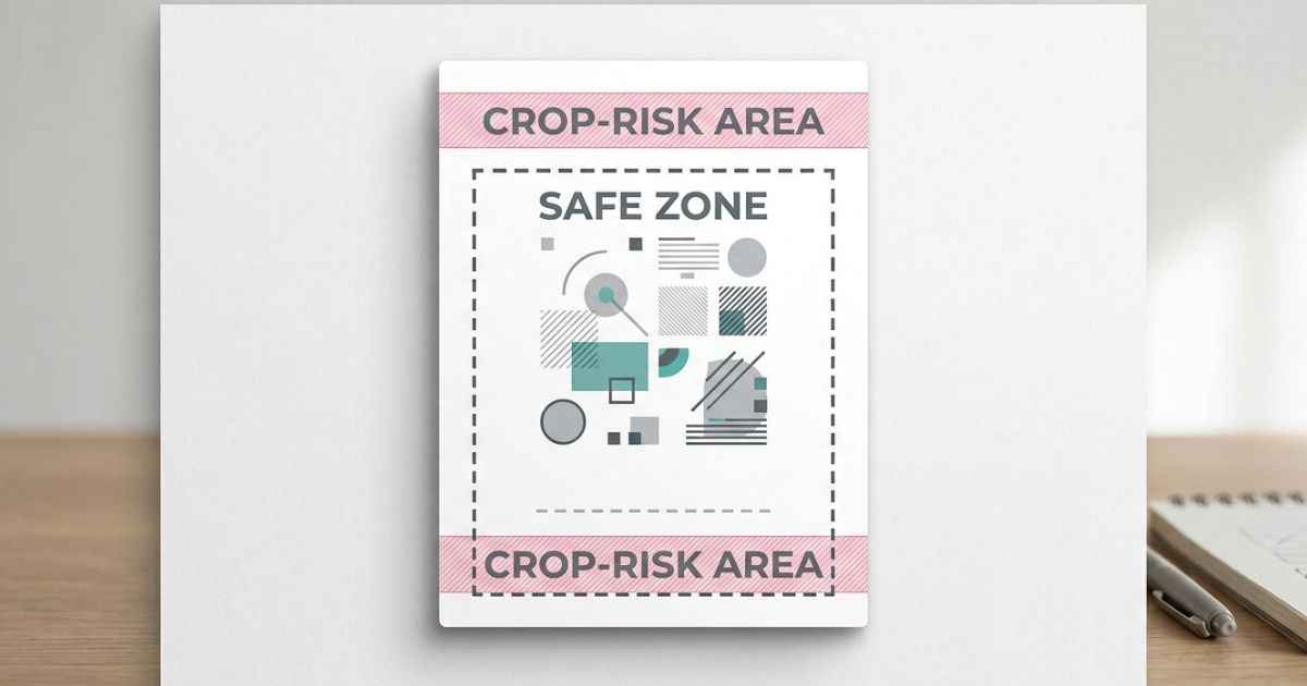
A YouTube Shorts cover can look different in the editor and after upload because it may appear in different layouts and surfaces. If you’re looking for the right YouTube Shorts Cover Size, 1080 × 1920 pixels is a common 9:16 canvas for vertical Shorts designs. This guide explains how to use that size, plus a simple safe-zone approach that helps keep your text and logo away from areas that may be covered or cropped.
Why Shorts Covers Get Cropped in the First Place
A Shorts cover can look different because it may appear in more than one place. YouTube may show the thumbnail differently based on where it appears and what device someone is using.
Some views show the full 9:16 image. Other layouts may zoom in a little or cover part of the image with buttons such as like, comment, and share. You cannot control every part of how YouTube displays the thumbnail, so it helps to keep important details away from these areas.
This is different from a standard 16:9 YouTube thumbnail because Shorts use a vertical video format. Their thumbnails can also appear in different places across YouTube. That makes safe placement more important when you design a Shorts cover.
The Correct Size for a Shorts Cover
For the Short itself, 1080 pixels wide by 1920 pixels tall is a common 9:16 canvas size for a vertical design. This is also the vertical format used by Instagram Reels and TikTok, so the same design can often be used on all three platforms. For YouTube Shorts, you select a frame from the Short instead of uploading a separate custom thumbnail like you can for a long-form video.
Starting with a smaller image can make it look soft or blurry when it is displayed at a larger size. A 1080 by 1920 canvas gives you a suitable 9:16 format for a vertical Short. If you are using an existing image, check its dimensions first. Using a vertical image is better than stretching a square or horizontal image to fit.
Understanding “Safe Zones”
A safe zone is an area where you place important parts of your design. Keeping your title, face, or logo in this area can lower the chance of it being covered or cropped in some layouts.
What Typically Gets Cut Off First
The edges and areas near interface buttons can be more likely to get covered or cropped. This depends on how the Short is being viewed. YouTube can also show interface elements around the video, such as channel information and action buttons.
Simple design guideline:
| Zone | What Usually Sits There | Safe for Text? |
|---|---|---|
| Top 10% | Channel name, video progress bar | No |
| Middle 80% | Main visual content | Yes |
| Bottom 10–15% | Like, comment, and share buttons | No |
The left and right edges may be safer, but it is still better to leave some space around the border.
A Simple Rule of Thumb for Placement
As a simple design rule, keep important text, faces, and logos away from the outer edges. Place them closer to the center of the frame instead. Leaving about a 10% margin on each side can lower the chance of important details being covered or cropped.
Designing Around the Safe Zone, Step by Step
Building a cover this way only takes a few extra checks.
Step 1: Start with the right canvas. Set your image to 1080 by 1920 pixels before adding anything else. This gives you the correct vertical format from the start.
Step 2: Sketch a rough safe-zone border. Leave about a 10% margin on each side. If your tool has a preview or grid guide, turn it on to help you see this area.
Step 3: Place your main subject first. Put the face, character, or main object away from the outer edges and areas where interface elements may appear.
Step 4: Add your title text inside the same margin. Keep the title short enough to stay easy to read on a small phone screen.
Step 5: Preview before exporting. A design can look fine at full size but still have text too close to the edge. Zoom out and check the smaller preview before you finish.
For a two-character or comparison-style Shorts cover, the layout is a little different because you need to fit two subjects into the frame. The VS Battle Poster Maker includes a 9:16 format for this type of layout, so you can arrange both subjects in a vertical design before exporting.
Once the layout looks right, export it at the appropriate dimensions and keep the file within YouTube’s applicable upload limits.
Where Else This Same Problem Shows Up
Cropping and safe-zone issues are not limited to Shorts covers. Other images can also be resized or cropped when a platform displays them.
Profile pictures are a common example. Discord, YouTube, and X can display profile photos in a circular shape, which can cut off parts of a square image. The PFP Maker lets you create profile images with platform-specific guides for Discord, YouTube, and X, so you can check the placement before saving your image.
Channel banners have a similar challenge because they need to work across different screen sizes and layouts. Keeping important content inside the recommended safe area helps it stay visible.
FAQs
What size should a YouTube Shorts cover be?
For a vertical Short design, 1080 pixels wide by 1920 pixels tall is a common 9:16 canvas size. This matches the vertical format used by Shorts and many other short-video platforms. For YouTube Shorts, you select a frame from the Short instead of uploading a separate custom thumbnail like you can for a long-form video.
Why does my Shorts cover look fine on my computer but cropped on my phone?
Different devices and layouts can show the same image in slightly different ways. A desktop view may show more of the image, while a phone layout may cover part of it with buttons or navigation.
How much margin should I leave around the edges?
A margin of about 10% on each side is a good starting point. It keeps your text and main subject away from the outer edges, where they may be covered or cropped.
Can I use the same cover for YouTube Shorts, Instagram Reels, and TikTok?
Often yes, since all three use a similar 9:16 vertical format. It is still worth checking the design on each platform because their layouts can be slightly different.
Does a Shorts cover need to match my regular video thumbnail?
Not exactly. Using a similar color scheme or font can help your channel look consistent. The layout may still need to change because vertical and horizontal videos use different shapes.
What happens if my text sits too close to the edge?
It may be cut off or covered by an interface element in some layouts. Moving important text toward the center lowers the chance of it being cropped or covered.
Next Step
Check your current Shorts cover using the simple guideline above. Move any important text, faces, or logos away from the outer edges before you upload it.