
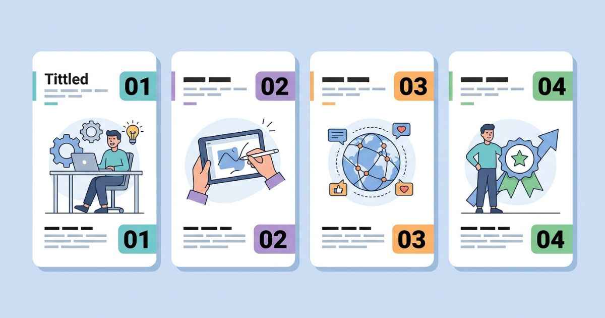
Matching thumbnails for a video series can make a channel look more organized and visually connected, rather than like a set of unrelated uploads. This guide covers what to keep the same across every episode, what should change, and a simple system for building a whole season’s worth of thumbnails without starting from scratch each time.
This is different from a single-thumbnail tutorial. Instead of focusing on one image, it looks at how a whole series should work together as a connected set.
Why Consistent Thumbnails Help a Series
A clear visual pattern can make a series easier to recognize when viewers see several thumbnails from the same channel. A consistent color palette, font, and layout act like a signature, so someone scrolling through a feed can spot your content before reading a single title.
This matters most for series content, where episodes are meant to be watched in order. A matching set of thumbnails can make it clearer that the videos belong to the same series and help the back catalog feel connected, rather than like a pile of separate clips.
The Three Things to Keep the Same Across Episodes
A consistent series doesn’t mean every thumbnail looks identical. It means a few specific choices stay fixed while everything else can change freely.
Color Theme
Pick one color palette, usually two or three main colors, and reuse it across every episode. A consistent color palette can make thumbnails easier to recognize as part of the same series.
Text Placement and Font Style
Keep your title text in the same general position and font across episodes, even if the words themselves change every time. A consistent text style gives the series a more recognizable visual pattern, without requiring extra design work.
Layout Structure
Decide on one composition, such as a centered focal image with text below it, and stick to that structure for the whole season. This gives the series a familiar visual structure that can remain recognizable even at a small thumbnail size in a crowded video feed.
What Should Change From Episode to Episode
The parts that should change are the parts tied to that specific episode’s content. The focal image, the episode number, and the title text should all update each time, since these are what actually tell a viewer what that particular video covers.
Keeping these elements different is just as important as keeping the others the same. If every thumbnail is nearly identical, viewers may have a harder time telling the episodes apart at a glance.
A Simple System for Building a Whole Season at Once
Building thumbnails one at a time, from scratch, for an entire season adds up to a lot of repeated work. A better approach is to lock in your fixed choices once, then batch through the parts that change.
Start by setting your color theme, font, and layout exactly the way you want them for the whole series. The title card generator can be used to keep your color, font, and layout choices consistent while you create each episode’s design.
Once that base setup is locked in, work through your episode list in one sitting. Swap in each episode’s focal image and title text, keeping the color, font, and layout untouched, then export and move to the next one. This makes the process more repeatable instead of requiring you to rebuild the design from scratch for every episode.
A quick checklist can help keep this process consistent:
- Same color palette across every episode
- Same font and text position across every episode
- Same overall layout structure across every episode
- Focal image and title text updated for each specific episode
Showing Progress Across a Season
Beyond individual thumbnails, some creators like to show a season’s overall arc in a single image, useful for recap videos or season-end wrap-ups. Mapping a whole season’s arc in one image is exactly what the Episode Timeline Maker is built for, since it lays out multiple episodes or milestones along one connected track.
This kind of graphic works well as a companion piece to your regular thumbnails, rather than a replacement for them. It can give returning viewers a quick visual summary of how a season progressed, which individual episode thumbnails aren’t designed to show on their own.
FAQs
Do all my thumbnails need to look exactly the same?
No. Keeping the color, font, and layout consistent is enough to build a recognizable series. The focal image and title text should still change with each episode.
What’s the easiest thing to keep consistent across a series?
Color palette is often one of the easiest elements to keep consistent across a series and can make the thumbnails feel more connected.
How many colors should a series color theme use?
Two or three main colors can be a simple starting point for a series color theme. Too many colors can make individual thumbnails feel inconsistent with each other, even if the same palette is technically being reused.
Should I build all my season’s thumbnails at once?
Batching them together, once your color, font, and layout are locked in, can reduce repeated setup work and help keep the whole set visually consistent.
Can a season’s thumbnails change style partway through?
Yes, this can work well for content with a clear tonal shift, such as a season that gets darker partway through. Keeping the change intentional and consistent from that point forward matters more than avoiding change entirely.
Next Step
Pick your fixed color, font, and layout choices first, then work through your episode list in one sitting using the checklist above.