
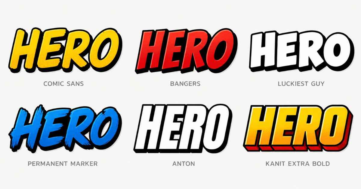
Popular free fonts for comic title cards include heavy, condensed, all-caps display fonts like Bangers, Anton, and Luckiest Guy. Their heavy letterforms can help keep titles readable at smaller sizes when the text has enough contrast, and they can give a punchy comic-book feel without costing anything. Several are available through Google Fonts under open licenses that allow broad use, including commercial projects, subject to their license terms. Some tools also skip the font search entirely by providing a font already built in.
What Makes a Font Feel “Comic-Style”?
Not every bold font reads as “comic-style.” A few common traits can give a font that punchy, larger-than-life feel often seen in comics and superhero art.
Heavy weight is the first trait. Heavy fonts can remain easier to read at smaller sizes, especially when the text has enough contrast. Thin, delicate fonts can become harder to read when you resize them.
Tight letter spacing is the second trait. Tighter letter spacing can give comic-style lettering a more compact and energetic look instead of a calm, spread-out one.
Blocky, slightly rough letterforms round it out. Some comic fonts use slightly irregular or hand-drawn-looking letterforms to create a more playful style, even though the font itself is fully digital.
Together, these traits can give a title font a strong visual presence, which can work well for bold title cards in a crowded YouTube feed.
6 Free Fonts Worth Trying
These six fonts are available at no cost, but check each font’s current license before using it in commercial projects. Each one also brings a slightly different comic-style personality.
Bangers Bangers is a popular comic-style font available at no cost. Its exaggerated, slightly wobbly letterforms look like they were lettered by hand for a classic comic panel. It works especially well for short, punchy titles and sound-effect style text.
Anton Anton is an ultra-bold, condensed sans-serif font. It doesn’t have the playful wobble of Bangers, but it makes up for that with sheer weight and impact. Anton is a strong pick when you want a modern, aggressive superhero look rather than a classic comic-strip feel.
Luckiest Guy Luckiest Guy has thick, rounded letters with a friendly, cartoonish energy. It reads less “gritty superhero” and more “fun comic adventure,” which makes it a great fit for lighter, more playful title cards.
Bebas Neue Bebas Neue is tall, narrow, and all-caps by design. It doesn’t scream “comic book” on its own the way Bangers does, but paired with a bold outline or glow effect, it becomes a clean, modern title font that still feels bold enough for a superhero thumbnail.
Passion One Passion One is rounded and heavy, sitting somewhere between Luckiest Guy’s playfulness and Anton’s aggression. Its heavy letterforms can work well at smaller sizes when the text has enough contrast, which makes it a solid choice for a title card that needs to stay readable as a tiny YouTube thumbnail.
Archivo Black Archivo Black is a straightforward, no-nonsense bold sans-serif. It’s less “comic” and more “impact,” which makes it a good choice when you want your title text to feel powerful without leaning into a cartoonish style.
Pairing a Bold Title Font With Body Text
A bold comic font works best as your headline, not as every line of text on the page. Using one heavy display font for the main title and a simpler, cleaner font for any smaller text can create contrast and make the overall design easier to read.
If your title card only has one line of text, this isn’t something you need to think about. But once you add a subtitle, episode number, or character name in smaller text, pairing matters. Try keeping the bold comic font for the biggest, most important words, and switch to a plain sans-serif for anything smaller.
This kind of contrast can also help guide the eye. Viewers should know exactly what to read first, and a single dominant bold font can help make the reading order clearer.
Why Some Tools Skip Font Selection Entirely
Picking the right font, testing it at small sizes, and getting the spacing to look right takes real time. That extra font selection can add another step to the design process.
That’s why some title card tools remove the decision altogether. Instead of offering a dropdown of fifty fonts to compare, they ship with one comic-style font already tuned for the job, tested at thumbnail size, and matched to outline and glow effects that are built to work with it.
The title card generator uses one custom comic-style font built in, so you never have to pick or install one yourself. You get a font that was already chosen with comic and superhero titles specifically in mind, which removes one font-selection step from the design process.
FAQs
Are Bangers, Anton, and Luckiest Guy really free to use?
Bangers, Anton, and Luckiest Guy are available through Google Fonts. Check the license shown for each font before using it in commercial work, including YouTube thumbnails and title cards.
What font do most professional comic titles use?
Many professional comics use custom, hand-lettered fonts made specifically for that series, but free fonts like Bangers and Anton can give your design a bold comic-inspired look without requiring custom lettering.
Can I use these fonts on Canva or Photoshop?
Some of these fonts may be available directly in Canva, while others can be downloaded and installed for use in supported design software. Fonts available through Google Fonts can be downloaded and installed for use in Photoshop and other supported design software.
What’s the best font size for a title card?
There’s no single fixed size, since it depends on the canvas dimensions. Test the title at the size viewers are likely to see it and make sure the words remain easy to read on a small screen.
Do I need to add an outline to a comic font?
An outline isn’t required, but it can help. A dark outline or glow behind bold text can help it stand out against busy or colorful backgrounds.
Is Bebas Neue too plain for a superhero title card?
On its own, Bebas Neue can look more modern than “comic-style,” but adding a bold outline, drop shadow, or glow effect can push it closer to that punchy superhero look.