
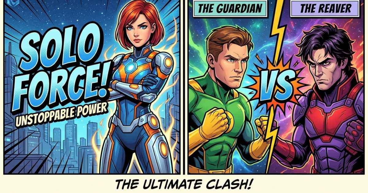
The choice between a VS poster and a title card depends on what your video is about and how many main subjects it has. A title card works well for a recap, review, or episode video about one main subject. A VS poster works well for comparisons, matchups, or “who would win” debates. If your video has one main focus, a title card is usually a good choice. If it compares two subjects, a VS poster can make that clear.
The Core Difference Between the Two
A title card usually has one main image or character, with bold text that tells viewers what the video is about. The design keeps the focus on one main subject.
A VS poster has two subjects instead of one. It often splits the image down the middle, puts one subject on each side, and adds a divider or “VS” graphic in the middle. This makes the comparison easy to understand at a glance.
Both formats can use similar design elements, such as bold comic-style text and strong outlines. The main difference is the layout. A title card shows what the video is about. A VS poster shows what the video is comparing.
When a Title Card Is the Better Choice
Short answer: use a title card when your video has one main subject, not two competing ones.
Recap and review videos are good examples. If you’re covering what happened in an episode or sharing your thoughts on a character’s story, there may be no clear “versus” angle. A single strong image with bold title text can show the topic clearly.
General episode discussion videos work the same way. Even if you talk about several characters in the video, a title card can keep the thumbnail simple if the main topic is the episode itself.
Character-focused content is another good fit. A video about one character’s powers, backstory, or growth can work well with one strong portrait and clear title text instead of a split-screen design.
The title card generator is built around this type of layout, with a bold text stack, optional background image, and comic-style outline and glow effects for one main subject.
When a VS Poster Is the Better Choice
Short answer: use a VS poster when your video’s main idea is a comparison between two subjects.
Matchup and “who would win” videos are a clear fit. These videos often use curiosity, and a split-screen poster with both characters facing each other can show the comparison before a viewer reads the title.
Debate and tier-list content can also work with this format when the video focuses on two specific characters or ideas going head-to-head, rather than ranking many subjects.
Rivalry-focused stories are another good example. Even without a strict “who would win” question, two characters with ongoing tension can make a good VS poster because the design puts them against each other.
For these types of videos, the VS Battle Poster Maker handles the split-screen layout, including the divider and VS graphic, so you don’t have to build the layout yourself.
Can You Use Both in the Same Video?
Yes, and this can be a useful approach. Many creators use a title card as the main YouTube thumbnail because its simpler layout can be easier to read at a small size. They can then use a VS poster inside the video when the comparison section starts.
The two formats can serve different purposes. The thumbnail should show what the video is about and attract attention. A VS poster inside the video can then introduce the specific matchup without also having to work as a small thumbnail.
If your whole video is about one comparison from start to finish, a VS poster can make sense as the thumbnail. If the comparison is only one part of a larger video, you can use the VS poster for that section and keep the main thumbnail simpler with a title card.
Quick Comparison Table
| Title Card | VS Poster |
|---|---|
| Best for | Single-subject videos |
| Layout | One main image or character |
| Common use | Recaps, reviews, character breakdowns |
| Can read well at small size | Yes, depending on the design |
| Can work inside the video too | Yes, as a section header |
| Best for | Two-subject comparisons |
| Layout | Split-screen with a divider |
| Common use | Matchups, debates, tier lists |
| Can read well at small size | Yes, if kept simple |
| Can work inside the video too | Yes, to introduce a matchup |
FAQs
Can a VS poster work as a video thumbnail?
Yes. A VS poster can work well as a thumbnail, especially for videos built around a comparison. Just make sure the text and subject images are large enough to read at a small size.
What size should I export either graphic at?
For a standard YouTube thumbnail, 1280×720 pixels is a common working size. For a vertical graphic made for Shorts or Reels, 1080×1920 pixels is a common 9:16 canvas size.
Do I need two images for a VS poster?
Yes, a VS poster is built around two subjects, so you’ll need one clear image for each side of the split-screen layout.
Is a title card always simpler to make than a VS poster?
Generally yes. A title card only needs one main image and text, while a VS poster requires two images and a divider to keep the layout balanced.
Can I turn a title card into a VS poster later?
Not directly, because the two layouts are different. You can, however, make a separate VS poster using the same character images if your content later moves toward a comparison.
Which format is better?
It depends on the content. A VS poster is a natural fit for comparison videos, while a title card is a better match for videos built around one main subject.