
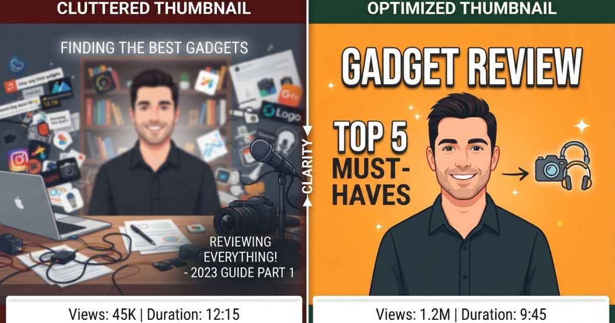
A low YouTube thumbnail CTR can have several common causes. CTR stands for click-through rate, which is the percentage of people who click your thumbnail after they see it. Maybe your thumbnail has no clear focal point. Maybe the contrast is weak. Maybe the thumbnail does not match the title. Or maybe your last ten thumbnails all look too similar. Once you identify the main issue, you can make a more focused redesign.
A Low CTR Usually Isn’t About One Thing
There is no single fix that improves a low CTR every time. Click-through rate is a useful signal, but it does not explain the whole problem by itself. A few small design issues can affect how people respond to a thumbnail at the same time.
The good news is that you can often spot these issues just by looking. Place your thumbnail next to other thumbnails in the same feed and compare them. Once you know what to look for, finding the main issue can be easier than trying a random redesign.
6 Common Reasons Your Thumbnail Isn’t Getting Clicks
No Clear Focal Point
A focal point is the main thing a viewer’s eyes notice first. Without one, the viewer may have trouble knowing where to look. In a fast-scrolling feed, a busy design can make the thumbnail harder to understand quickly. Busy backgrounds, too many same-size elements, or text competing with a character for attention can cause this. One strong image with bold title text can make the design easier to follow. This is also the basic approach used by the title card generator, which focuses on a clear title and main visual.
Text and Background Blend Together
Text that blends into the background can make a thumbnail harder to read. If text is difficult to read at a small size, viewers may move past it without understanding the message. Check your thumbnail at a realistic mobile size instead of only looking at it while zoomed in. A problem that is hard to notice up close can become much clearer when the image is smaller. Adding a bold outline or shadow behind your text can help separate it from the background.
The Thumbnail Doesn’t Match the Title
When your thumbnail suggests one thing and your title suggests another, viewers may not get what they expected after clicking. A mismatch can affect how viewers respond to the video after the click. Keeping your thumbnail consistent with what the video actually offers gives viewers a clearer idea of what they are about to watch.
Every Video Looks the Same (Fatigue)
If every thumbnail on your channel uses the same layout, colors, and pose, longtime viewers may start paying less attention to them. This is sometimes described as thumbnail fatigue. It can happen slowly, so it is easy to miss when you are looking at your own channel. Changing your colors or layout every few videos, while keeping your overall style familiar, can give your thumbnails some visual variety.
Too Much Going On
Packing several characters, lines of text, and extra graphics into one thumbnail can make the design harder to understand. A crowded design may look more like noise than useful information. Viewers often see thumbnails at small sizes, so there is limited space for many details. Cutting your thumbnail down to one strong idea can make the message easier to understand than trying to show several ideas at once.
No Emotional Hook
A thumbnail can look good but still be easy to scroll past if it gives viewers no clear reason to feel curious or interested. This can happen when there is no strong emotional or visual hook. A clear facial expression, dramatic lighting, or a short line of text can add more interest. Pairing a character with a short, punchy line of text, like the designs you can make with the Character Quote Card Maker, can add a stronger hook without making the design too busy.
How to Actually Test Which Fix Worked
Guessing which change worked is not always reliable. View counts can go up and down for many reasons that have nothing to do with your thumbnail. YouTube also offers thumbnail testing features that let eligible creators compare different thumbnail versions for the same video.
Give a test enough time to collect useful data before judging the result. A test checked too early can be affected by normal changes in traffic and viewer behavior. Once enough data is available, you can compare the versions and see which one performed better.
Keep a simple record of what you changed in each test. Maybe it was a new focal point, more contrast, or a different color. After a few tests, this record can help you understand what works for your own audience instead of relying only on general thumbnail advice.
FAQs
What is considered a good YouTube thumbnail CTR?
A good CTR depends on factors such as your audience, topic, traffic source, and how widely the video is being shown. There is no single CTR number that works as a target for every channel.
How long should I run a thumbnail test before checking results?
Give the test enough time to collect meaningful data rather than judging it after only a small number of impressions. A small sample can produce numbers that change significantly as more viewers see each version.
Can a low CTR hurt my channel’s overall performance?
A low CTR can mean that fewer people click when they see your video, but CTR is only one part of how a video performs. YouTube recommendations can also depend on factors such as viewer satisfaction, watch behavior, and the audience receiving the video.
Should I change my whole thumbnail style if my CTR drops suddenly?
Not right away. Look for a specific cause first, such as a title mismatch, weak contrast, or a design that has become too repetitive. Changing your whole style without knowing the cause can make it harder to tell which change actually helped.
Does adding more text to a thumbnail help or hurt CTR?
It depends on how much text you use and how easy it is to read. A short, clear phrase can add useful context or a hook. Several lines of text can make the design harder to understand, especially at a small size.
Is thumbnail fatigue really a real problem, or just a theory?
Repeated visual patterns can make thumbnails feel less noticeable to returning viewers, although the effect can vary from channel to channel. Changing the layout or visual treatment from time to time can add variety while still keeping a recognizable style.